

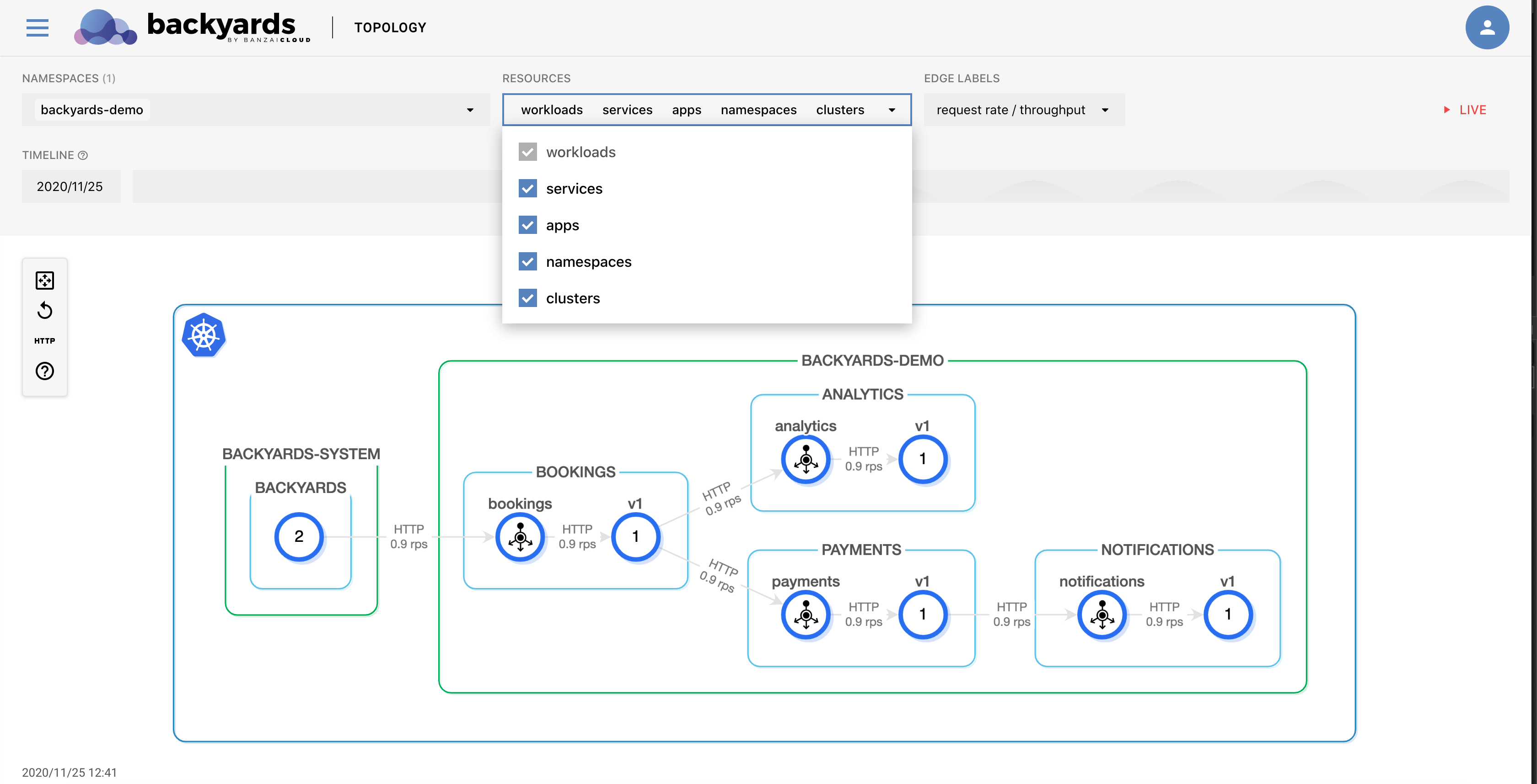
The MENU > TOPOLOGY page of the Backyards web interface displays the topology of services and workloads inside the mesh, and annotates it with real-time and information about latency, throughput, or HTTP request failures. You can also display historical data by adjusting the timeline.
The topology view is almost entirely based on metrics: metrics received from Prometheus and enhanced with information from Kubernetes.
The topology page serves as a starting point of diagnosing problems within the mesh. Backyards is integrated with Grafana and Jaeger for easy access to in-depth monitoring and distributed traces of various services.
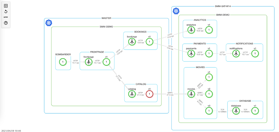
The nodes in the graph are services or workloads, while the arrows represent network connections between different services. This is based on Istio metrics retrieved from Prometheus.
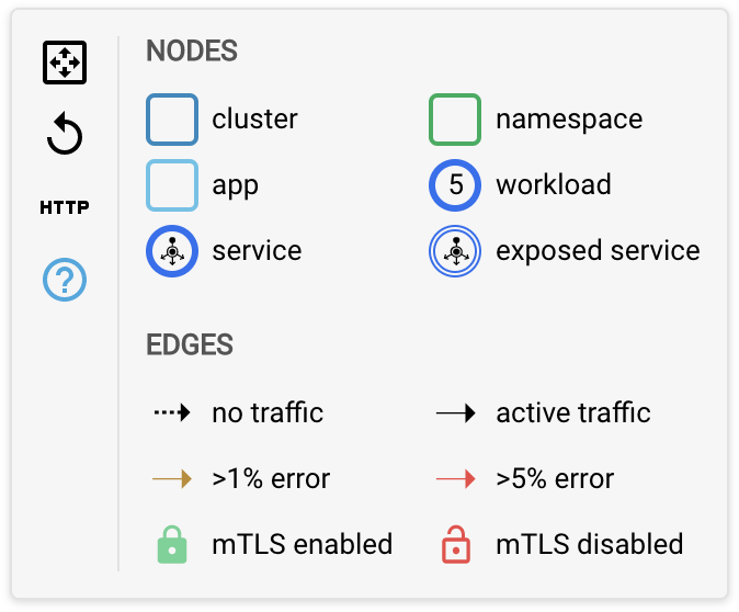
The graph serves as a visual monitoring tool, as it displays various errors and metrics in the system. Click the ? icon on the left to show a legend of the graph to better understand what the icons mean in the graph.
If your application hasn’t received any traffic yet, there will be no metrics in the system so you won’t see any visualization yet. To send some traffic to your services as a test, see Generate test load.
Select the data displayed 🔗︎
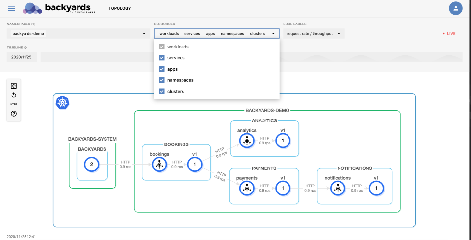
You can select and configure what is displayed on the graph and how often the data is updated in the top bar of the screen.


Namespaces 🔗︎
Display data only for the selected namespaces.
Resources 🔗︎
You can select the type of resources you want to display in the graph. The following resources can be displayed in a cluster: clusters, namespaces, apps, services, and workloads.
Workloads are always shown, they cannot be disabled.
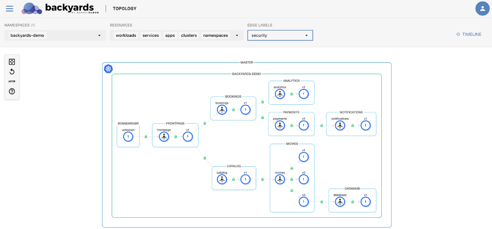
Here’s an example when only apps, services and workloads are shown:
Showing clusters is important in multi-cloud and hybrid-cloud environments. For details, see Multi cluster.
Edge labels 🔗︎
The labels on the edges of the graph can display various real-time information about the traffic between services. You can display the following information:
- the protocol used in the communication (
HTTP,gRPC,TCP) and the request rate (or throughput for TCP connections), - actual P95 latency, or
- whether the connection is using mTLS or not.

Timeline 🔗︎
By default, the graph displays the current data. The timeline view allows you to select a specific point in time, and then move minutes back and forth to see how your most important metrics have changed. For example, you can use it to check how things changed for a specific service, when did the error rates go up, or how your latency values have changed over time when RPS values increased. This can be a good indicator to know where to look for errors in the logs, or to notice if something else has changed in the cluster that can be related to a specific failure.
- To display the timeline, select TIMELINE on the left, then use the timeline bar to adjust the date and the time. The date corresponding to the displayed data is shown below the topology graph.
- To return to the current real-time data, select LIVE.


Drill-down to the pods and nodes 🔗︎
You can drill-down from the MENU > TOPOLOGY page by selecting a service or a workload in the Istio service mesh. You can trace back an issue from the top-level service mesh layer by navigating deeper in the stack, and see the status and most important metrics of your Kubernetes controllers, pods, and nodes.
See Drill-down for details.


